
The Unwritten - Squished and Stretched
A Comic I've Been Reading!
It’s been (checks calendar) three entire years since I last wrote anything about comics sort of comics criticism, based on my author page on Multiversity Comics. There’s a possibility that a piece I wrote for The MNT (RIP) went up after that, but since that’s been scrubbed from the internet, let’s say three years just to be safe.
And I’ve missed it! Writing about comics is a different muscle than actually making one, and it’s a fun muscle to flex every once in a while. This is (hopefully!) one of the things I’m going to be using this newsletter for, so if you want to see my thoughts on, what you will soon see is a very, very specific part of some comics I’ve been reading, keep scrolling!
The Unwritten Book 1
Issues 1-12
By Mike Cary and Peter Gross
Finishes by Jimmy Broxton, Kurt Higgins, Zelda Devon
Colors by Chris Chuckry, Jeanne McGee, Kurt Higgins, Zelda Devon
Letters by Todd Klein
Covers by Yuko Shimizu
The elevator pitch on this book is basically, what if Harry Potter was a based on the authors real son, like the real-life Christopher Robin and his counterpart in Winnie the Pooh. But it’s also much more than that. It’s about how stories affect us, how they change the world around us, all of that stuff. It’s very much a Story About Stories, which if you like, you’ll like, and if you don’t, well, I don’t think this is going to change your mind. But as someone who grew up reading far too much Terry Pratchett and Neil Gaiman, I’m an absolute sucker for Stories About Stories.
Of course, there’s the other weird thing about reading a pastiche of Harry Potter in 2023 is that J. K. Rowling has fully taken her heel turn into being a loud, dangerous, deeply transphobic bigot. It’s strange to think that this is the most I’ve interacted with something Potter related in years (with the exception of Alan Moore and Kevin O'Neill’s turning him into the Antichrist.) There’s a lot to be said about Rowling and Potter, and all of it has been said far more eloquently than I have here. Basically, fuck TERFs, fuck Rowling, and don’t give her any of your money.
But, none of that has much to do with the actual book, which is a lot of fun! I’ve listed the credits for the entirety of the Deluxe Book One, which covers the first 12 issues and is what I’ve read of the series so far. But, I’m not really going to talk much about the book itself, which I’m enjoying, but don’t have much to say about. The story is, so far, a tour of different important fictional works, digging into how that fiction shapes the world around us, and how nefarious forces might try to control fiction to control the real world. The covers, by Yuko Shimizu, are also gorgeous. Every single one of them. If you’re interesting in seeing someone dig into the themes, storytelling and allusions present in the book (of which there are many) you should check out Steven Morris’s ongoing, issue by issue reread of the series at Shelfdust, which has gotten up to issue 11 and which you can read here. Oh, and there’s this great piece published a few years ago on Comic’s Bookcase by Taylor Pechter. Check these out of you want to see people engaging with the story far more thoroughly than I’m going to do here.
What I do want to spend a bit of time on, and what is most interesting to me is (maybe unsurprisingly) the lettering. Todd Klein is, of course, amazing. But what has stood out to me is that, even though he’s been lettering digitally for decades at this point, he still letters digital comics like he’s hand-lettering them. That last sentence is nonsense, but it feels true for just about every book I’ve read that is lettered by him in the past twenty years.
There’s one part of his lettering in particular that I’ve noticed a lot of that I think highlights this. In the dialogue of The Unwritten, Klein has a habit of just decreasing or increase the width of a particular line in a balloon to help make the dialogue stack better. This is a little difficult to explain without visual aids, so I’ve created a couple. First up, here’s a random panel from issue #10, where we see Joseph Goebbels gabbling about something or other.
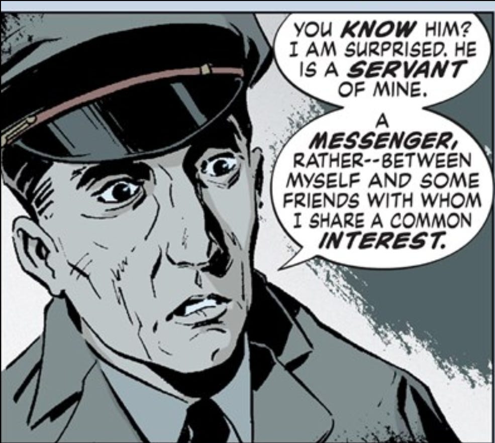
The thing I want to focus on is in the second balloon, the 6th line down, or the second line from the bottom. If you look closely, you’ll see that the text of this line is just a bit skinnier than the lines around it. Nate Pieko’s calls this the 94% Rule. Here’s an example of two fonts, with the text stacked the same, but with the line at both 85% width and 100% width, so you can see more easily what I’m talking about.
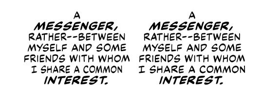
It’s not a huge change, but it’s one that successfully make the text stack more smoothly, creating a nice circle rather than the more pear shaped second example.
This isn’t an especially unusual technique (obviously, if there’s an entire rule for it that I can link to) but what did catch my eye is just how liberal Klein is with his width shrinking or increasing. It doesn’t happen in every single balloon, but it does happen often enough that it is noticeable if you’re keeping an eye out for it. And maybe more importantly, it doesn’t feel Klein is trying to hide it. Peiko’s suggests 94% as the amount you can squish the text without it seeming noticeable, but to my eye, Klein has made things skinnier than that. And he does it throughout the book. If there’s a line that would look better if it’s a bit skinner, he just goes ahead and make it skinner. If it could stand to be a smidge wider, poof, it’s a bit wider. It’s like Klein has decided that having the text in a balloon stack nicely is simply more important than having the font be a consistent.
Which is what I mean what I say that Klein letters digitally like he is hand-lettering. I’ve never hand-lettered anything, but I can imagine it’s much easier when hand-lettering to decide to just make the letters on a line a bit skinner when needed so that they’ll fit better. Why not, right?
I think it’s easy, when lettering digitally, to adhere to certain rules and consistencies that you need to follow. When you look at older, hand-lettered books, there are so many “rules” that I’ve learned as vital parts of digital lettering that are observed by hand-letterers haphazardly, if at all. Which isn’t to say that Klein’s lettering is inconsistent! It’s far from it. It’s just that the type of consistency he has decided is important is different from what I, as someone who has only ever lettered digitally, would focus on.
It’s something I want to keep in mind in my own lettering. If it would make a balloon stack better to shrink a line down a bit, even if it is a little noticeable, who cares? What is more important, that there is consistency in the font width or that there is a consistent smoothness in how the text stacks?
No big answers here, and no vital lesson learned, but it’s something I think I’m going to try in my books going forward. And if you notice a bunch of squished up text in the next book I letter that looks like shit, well, you can go ahead and blame Todd Klein.
Still not sure how to end a newsletter, huh?
Nope! Bye.
-Reed